Subscribe!

Bathroom Dilemma
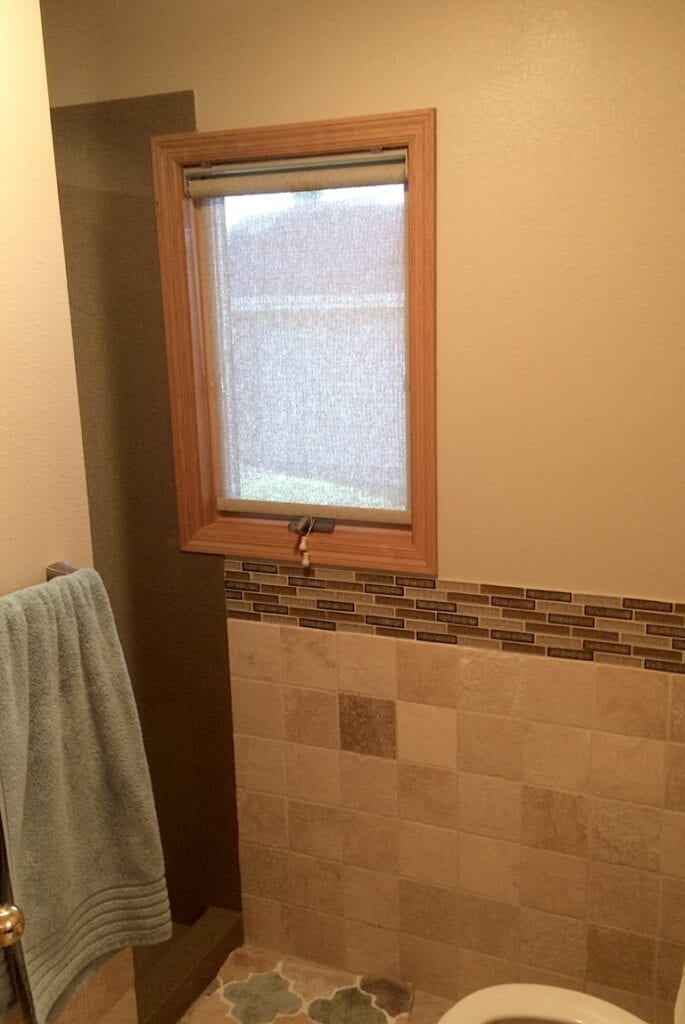
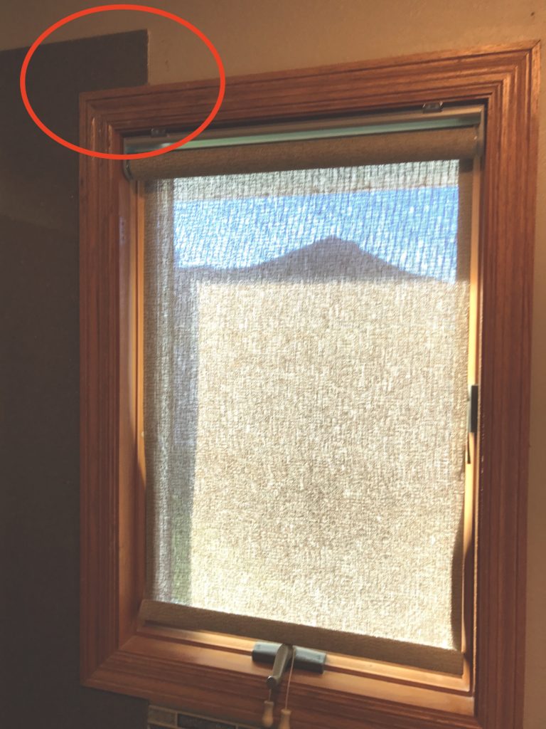
Recently I was introduced to clients who really didn’t like the end results of their bathroom window. They decided to renovate the master bath eliminate the shower/tub unit and change it into a walk in shower area. The end results was not pleasing to the eye when the shower surround bumped into the window frame.
We felt the lower portion of the window was acceptable because the tile on the lower portion of the room blended into the shower surround. What they didn’t like was the top left corner of the window where it met with the shower.
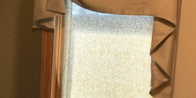
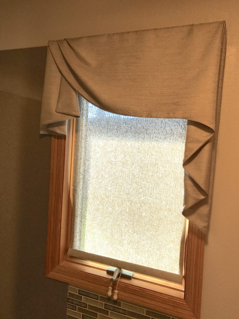
The photo below was the final window treatment idea that worked well to cover uneven lines on the top left corner of the window. This topper added softness and blended nicely with the colors that were used in the tiles. This board mount valance was mounted in line with the top of the shower surround. Because of this being a small bathroom the color and the design of the treatment was a great choice for this bathroom dilemma!


